Image Composition refers to the arrangement of elements on a screen, whether it is a painting or drawing, a photograph or a frame in television or cinema.
The main elements that are an essential part of the composition of any image are the main subject, the foreground and the secondary motifs, and all this components must be in harmony in order to get the most out of the aesthetics quality of the image; on the other hand, characteristics like texture, color balance or shapes, among many others, have to be taken into account to create an image that is pleasant to see and that can communicate something.
When composing an image, the main goal is to make it have an emotional impact, transmit a thought, or simply create something new that has some sort of impact on the viewer. However, a correct image composition is not only related the creation of a beautiful image, or aesthetically appealing; the image should be appropriated to the context and it must be able to convey a message through the disposition of all its elements. The framing, i.e. the portion of the image that is seen, the selected point of view, must be done in a way that grabs the attention of the viewers, making them focus on a specific point of the image. The point of interest doesn’t necessarily need to be in the foreground of the image, it can be anywhere as long as it stands out. The shape, size and importance of people/objects in the image should always be considered.
If an image is not well composed, the viewer will focus his attention on a less relevant detail of the scene portrayed, which may lead to a wrong interpretation of the message that is supposed to be transmitted. So, it is of utter importance that all the elements are placed in a way that makes sense to the viewer, in order for him to be able to observe the whole image, and not only the focus point.
The viewer is then an important factor for the construction of an image, since it is for him that the image is composed, and he is the one who will have to comprehend its meaning; every image is made with a defined goal, and one thing all images have in common is that they were created to be observed by someone, who will interpret it according to his social and cultural background, previous knowledge and own taste, among many other influences that will have a key role in how an image is perceived. In this sense, the importance of the image composition is even more relevant, because each viewer is already so influenced by his own personal background that the image should be at the same time as easy to understand as possible, but also as interesting as possible.
Regarding the technique, the visual elements that form the images can be divided into:
– mass: people, objects, etc.;
– depth: perspective, real or apparent depth of the scene;
– lines: direction of the movements, line within the image;
– tones: colors, brightness and contrast.
The control of this elements is made with the right disposition of people and objects and correct illumination, and, in case of cinema, television and photography, with the adequate placement of the camera and the correct selection of focal distance.
There are many rules that can be applied to the creation of a painting, a photography or a movie frame, and that contribute to the overall harmony and balance of the images, being the two most important rules the balance rule and the rule of thirds.
The balance in an image can be attained through a careful disposition of all its elements. Given that, all the elements should be positioned according to its “visual weight”, which is intuitively associated to each element, i.e., larger and brighter objects have greater importance than smaller and darker objects. The balance also refers to the vertical composition of the image, so a composition is more natural if the heavier objects are below the others, and vice-versa. The composition can also be symmetrical or asymmetrical, regarding the mass of the elements. In a symmetrical composition the elements located in the same axle have the same weight, which makes the image very formal and uninteresting. Asymmetrical compositions are usually more creative and aesthetically interesting.

Example of assymmetrical composition

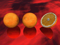
Example of symmetrical composition
The rule of thirds is one of the oldest and most well-known rules about image composition, the ancient Greeks referred to it as “golden ration”.
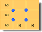
According to the rule of thirds, the geometrical center of a screen is not always the best place to put the core element of the image, because the image may lose its interest and dynamic. Given that, the rule of thirds dictates that the screen should be divided in three parts, both horizontally and vertically; the best images are the ones in which the main element is located in one of the four points of intersection of the lines that divide the image; the choice of the point in which the central element should be positioned depends on the subject and on the message that is supposed to be conveyed. All other important elements of the image should be place along the lines or at the intersection points.

Division defined by the rule of thirds


